Jeff Bezos and Causal Loop Diagrams
Estimated reading time: 5 minutes.
Today I am showing how “natural” Systems Thinking can feel and give you enough so you can see how to use it yourself.
Many techniques give you the feeling that they are challenging to understand and take real mastery to start. But this is not how it works for most Structured Visual Thinking Methods.
So, if I get the story right, then around 2000, Jeff Bezos, founder of Amazon, sat in a restaurant after a meeting where he and his team discussed “Business Flywheels”. So he decided to do a flywheel on his own, famously on a napkin, and the outcome looked like this:

What does this picture mean?
Bezos and his lieutenants sketched their own virtuous cycle, which they believed powered their business. It went something like this: lower prices led to more customer visits. More customers increased the volume of sales and attracted more commission-paying third-party sellers to the site. That allowed Amazon to get more out of fixed costs like the fulfillment centers and the servers needed to run the website. This greater efficiency then enabled it to lower prices further. Feed any part of this flywheel, they reasoned, and it should accelerate the loop. — Brad Stone, The Everything Store
I hope this makes sense to everyone. And over 20 years later, one can see how this was successful. Fuelled by initial growth, the gravitation towards Amazon continued, and Amazon became one of the most profitable companies in the world. The growth was reinforced by what the company did.
But what kind of diagram did Jeff draw? It is a “lazy” version of a so-called Causal Loop Diagram (CSD), as it is often used in the domain of Systems Thinking. CSDs are very simple to draw and can provide tremendous insights.
CSD are about what is technically called “stocks”. A stock is anything that can be counted: people, money, roads and windows or things that can be (even poorly) quantified, like goodwill, health, etc. The important part is that you can still make assessments like “sports will improve your health” while “a bag of crisps does affect your health negatively”. Then you think about how these stocks are influencing each other. Assuming stock A is increasing, what would be the impact on stock B? To stay in the previous example: “If you do more sports, then it will improve your health”, which includes as well the opposite statement “If you do fewer sports, then your health will decrease”. Side note: both statements are more generically true than always in every case. I don’t talk about extremes, like extreme sports, that might become unhealthy. But for most of the population, some sports would be good; more would be better. The other way to influence is a negative influence. The more crisps you eat, the less healthy you will be (again, on average). The following graph shows this basic understanding:
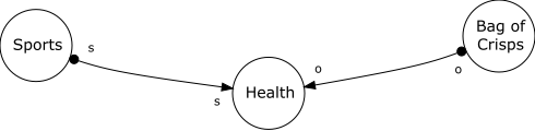
This simple graph has three “stocks” and two “edges” or connections connecting the stocks. The connections are labelled with s for “same” direction of influence and o for “opposite” direction of influence.
This is nice, but it doesn’t deliver much value yet. It becomes more interesting when you create loops. Assuming a bank account in times of normal interest rates (interest >0). If you have money in your account (a stock), then you will get Interest paid on money on the account (another stock). The direction of influence is “same”. More money in the account delivers more interest. Interest, by the way, goes back to the account. So, there is another influence. This looks like this:
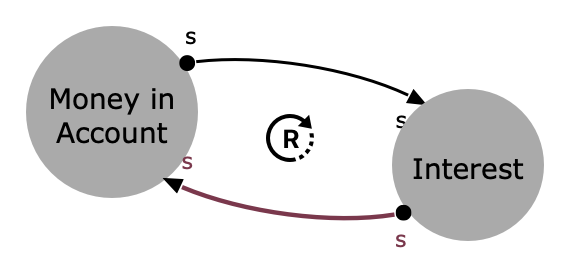
What you see here is that we have created a reinforcing loop. If you don’t influence this system in any way, you will have a runaway system that will produce more and more money on the account, which is basically what we understand under compound interest. Vithanco highlights this loop with a circle in the direction of the loop and the letter R for the reinforcing type of the system.
There are two types of loops: reinforcing and balancing, based on the number of opposing connections.
| Loop Type | Description | Behaviour |
| Balancing | Balancing loops have an odd number of opposite connections. | Balancing loops are associated with reaching a plateau. |
| Reinforcing | Reinforcing loops have an even number of opposite connections (please note that zero also is even). | Reinforcing loops are associated with exponential increases/decreases. |
Add a few more stocks, and you can start analysing complex systems. But already simple models can show the complexity of situations. Let’s review the Adoption Model.
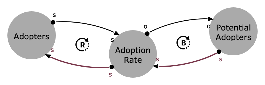
The model is about adopting any new trend/product/service. It has two loops that influence the overall adoption rate. Suppose the adoption rate won’t change, and the pool of potential adopters doesn’t change. We will experience an exponential increase in adopters until the small remaining stock of potential adopters keeps the adoption rate low.
Coming back to Amazon’s flywheel we started with. I recreated it in Vithanco and it looks like this (please note, that I changed the model slightly, as the stock is “prices” and “costs” instead of “lower costs” and “lower prices” and hence two connections became opposite):
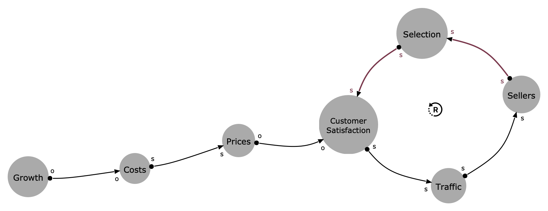
Now you can see what the business flywheel is about. It’s nothing else than a reinforcing loop. A loop that made Amazon one of the most successful companies of these days. And if we compare this with the adoption model from above then we can see why Amazon’s growth stopped. Jeff Bezos didn’t include the balancing loop from the Adoption Model in his diagram. The market was so big for him in 2000 that he didn’t need to think about it. But after 20 successful years of exponential growth, the stock of potential adopters got smaller and smaller.
I will talk more about Causal Loop diagrams, but for now, I suggest the excellent introduction from Donella Meadows’ Thinking in Systems for further reading.